NIH | National Cancer Institute | NCI Wiki  

WIKI MAINTENANCE NOTICE

Please be advised that NCI Wiki will be will be undergoing maintenance on Monday, June 24th between 1000 ET and 1100 ET.
Wiki will remain available, but users may experience screen refreshes or HTTP 502 errors during the maintenance period. If you encounter these errors, wait 1-2 minutes, then refresh your page.

If you have any questions or concerns, please contact the CBIIT Atlassian Management Team.

Error rendering macro 'rw-search'

null

Versions Compared

Key

  • This line was added.
  • This line was removed.
  • Formatting was changed.

...

To select data in a data table, first click the DataTable tab, then click a row, which represents an image series.

The single row appears in a A new browser window appears, showing information about all of the images in that series.

Row of data from the TCGA-BRCA collection

Using the SPLOM Tab

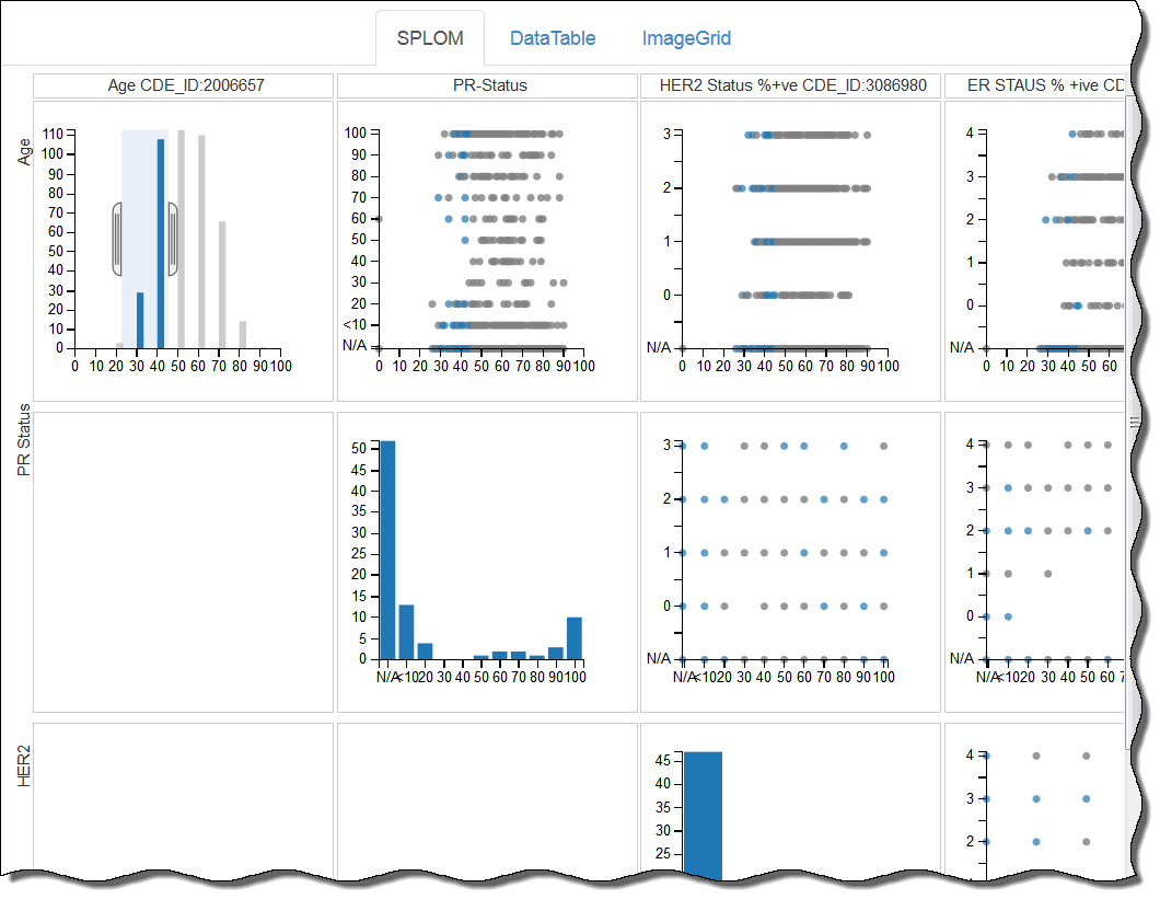
DataScope displays both uses bubble charts, which charts and bar graphs on the SPLOM (ScatterPLot Of Matrices) tab. Bubble charts are a type of scatterplot in which the data points are replaced with bubbles. An additional dimension of the data is represented in the size of the bubbles. Can A bubble chart can be used to visualize 4 dimensions.four dimensions.

SPLOM tab showing a set of bubble charts and bar graphsImage Added

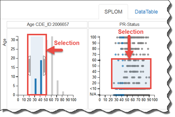
You can filter data on the SPLOM tab by adjusting the brackets in a histogram, as explained above, or by defining a selection area in a bubble chart.

Selections in a histogram and a bubble chart on the SPLOM tabImage Added

Using an Image Grid

...