Page History
| Panel | ||||
|---|---|---|---|---|
| ||||
|
Introduction to DataScope
DataScope allows you to browse and integrate multiple data types and visualize massive amounts of data. Using interactive, linked filters and visualizations, you can narrow down the data you want to see and immediately see the results in bubble charts, data tables, image grids, and heatmaps.
...
See DataScope in action in this DataScope video.
Accessing to DataScope
You must have a Google account to log in to DataScope.
...
- In any browser, go to camicroscope.org
.Multiexcerpt include nopanel true MultiExcerptName ExitDisclaimer PageWithExcerpt wikicontent:Exit Disclaimer to Include
The caMicroscope Login page appears.

- Click
 .
.
If you have not yet logged into Google, you are prompted the log in. Once you are logged in, the Google Offline Access page appears.

- Click Allow.
The caMicroscope page of product options appears.

- Scroll down to the DataScope - beta release section and click
 .
.
A demo of DataScope appears.
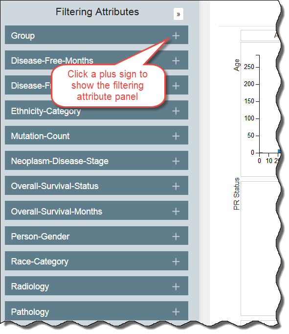
Filtering the Data
DataScope includes many filters for adjusting your view of the data. Filters are cumulative, which means that you can apply multiple filters to help narrow down your results. The filters are also interactive, meaning that when you set one filter, you impact the rest. For example, selecting one age cohort may mean that data is not available for a certain ethnicity.
...
In the following example, all of the filtering attribute panels are hidden.
Clearing Filters
You must clear each filter individually by clicking  in each panel. As you clear a filter, the number of records that meet your filtering criteria will likely increase. You may want to note a control value, such as the number of records in the group, to illustrate the change in selected records as you apply filters.
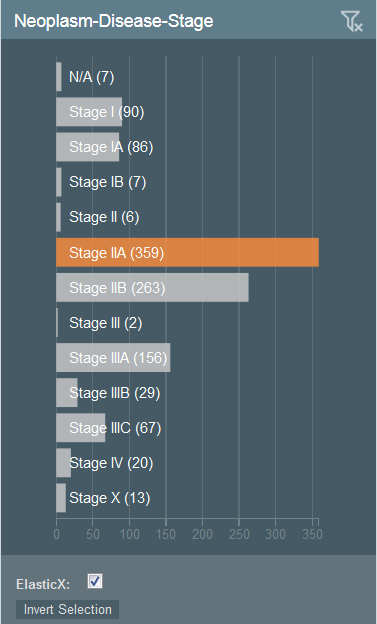
Bar Graphs
You apply filtering attributes differently depending on their graph type.
...
In the following graph, Stage IIA has been selected, making the other bars unavailable for selection.
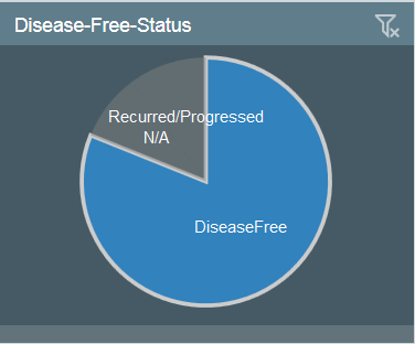
Pie Charts
To filter using a pie chart, click one or more pieces of the pie.
...
In the following chart, the DiseaseFree category has been selected and the other categories are not available.
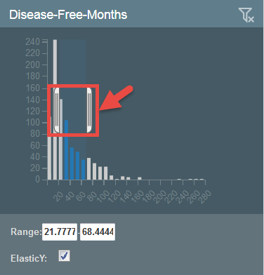
Histograms
To filter attributes using a histogram, you have two options that accomplish the same thing:
...
In the following histogram, a range has been selected, which exists between the brackets and appears in the range boxes below the chart. The values are entered automatically as you move the brackets.
Understanding the Visualization Types
DataScope is interactive and provides multiple options for visualizing a large database. These options include selecting filtering attributes and viewing the data in a table, bubble chart (also called scatterplot or SPLOM), image grid, or heatmap.
In the case of bubble charts, you can use these options in combination. For example, if you have already applied a filtering attribute to show only one age group, you can further narrow down your selection by selecting a different category in the bubble chart.
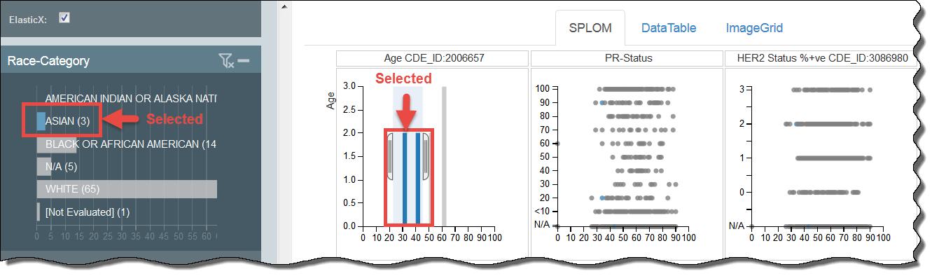
In the following example, a user has selected the filtering category of Asian and then further filtered the results to show those Asians between the ages of 30 and 40. Blue data points are selected, while grey are unavailable for selection.
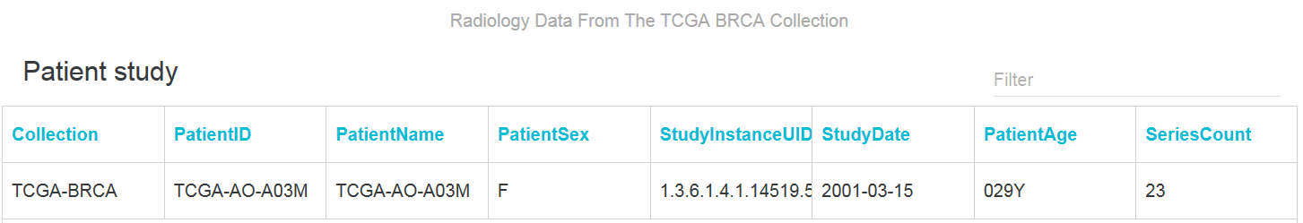
Using a Data Table
A data table provides a tabular representation of the data. Data tables show 100 records at a time and you can page through them. The following is an example of a data table.
...
A new browser window appears, showing patient information relevant to the radiology data.
Using the SPLOM Tab
DataScope displays both various types of charts, including bubble charts and histograms, on the SPLOM (ScatterPLot Of Matrices) tab. Bubble charts are a type of scatterplot in which the data points are replaced with bubbles. An additional dimension of the data is represented in the size of the bubbles.
...
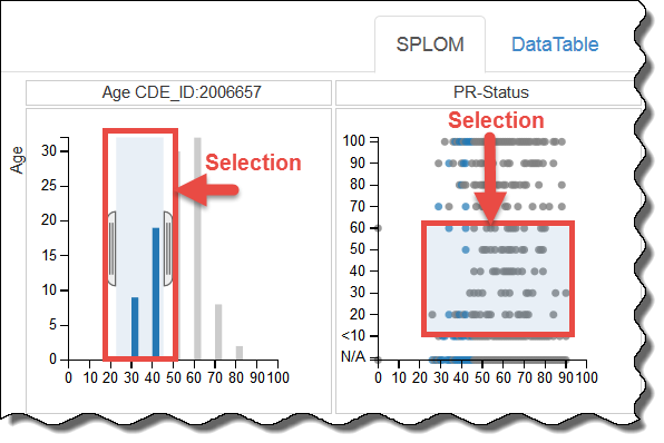
You can filter data on the SPLOM tab by adjusting the brackets in a histogram, as explained above, or by defining a selection area in a bubble chart. Only blue bars or dots within the selection area are available for selection. The background of the area you have selected is shaded blue.
Using an Image Grid
An Image Grid is a two-column list of images. When more screen real estate becomes available, the list of images expands to add more columns.
...
To select an image grid, click the ImageGrid tab. All of the images matching the filters you selected appear. Click an image to open it in caMicroscope. Each time you click the image, it zooms in further. Learn more about using caMicroscope in the caMicroscope User's Guide
| Multiexcerpt include | ||||||
|---|---|---|---|---|---|---|
|
Heatmap
A heatmap is a graphical representation of data in which the individual values contained in a matrix are represented by colors. The demo was not configured for this type of visualization, so this tab does not appear in the demo.
...