Page History
...
DataScope is interactive and provides multiple options for filtering visualizing a large database. These options include selecting filtering attributes and selecting a portion of a data viewing the data in a table, bubble chart (also called a scatterplot or scatterplot (SPLOM), image grid, or heatmap.
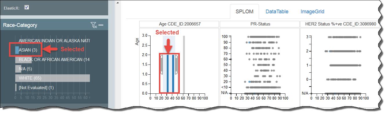
In the case of scatterplots, you can use these options in combination. The filters are cumulative; that isFor example, if you have already applied the filtering attributes discussed above a filtering attributeDataScope User's Guide (Draft)to show only one age group, for example, you can further narrow down your selection by selecting a portion of the bubble chart, image grid, or heatmap. Data tables are an exception; you can only narrow down that selection by clicking a row in the table and showing the details for that rowdifferent category in the scatterplot.
In the following example, selections include the Race-Category a user has selected the filtering category of Asian and the age range then further filtered the results to show those Asians between the ages of 30 -and 40. Data in blue is selected while data in grey is not available Blue data points are selected, while grey are unavailable for selection.
Using a Data Table
Provides A data table provides a tabular representation of the provided attributes. Shows Data tables show 100 records at a time. The following is an example of a data table.
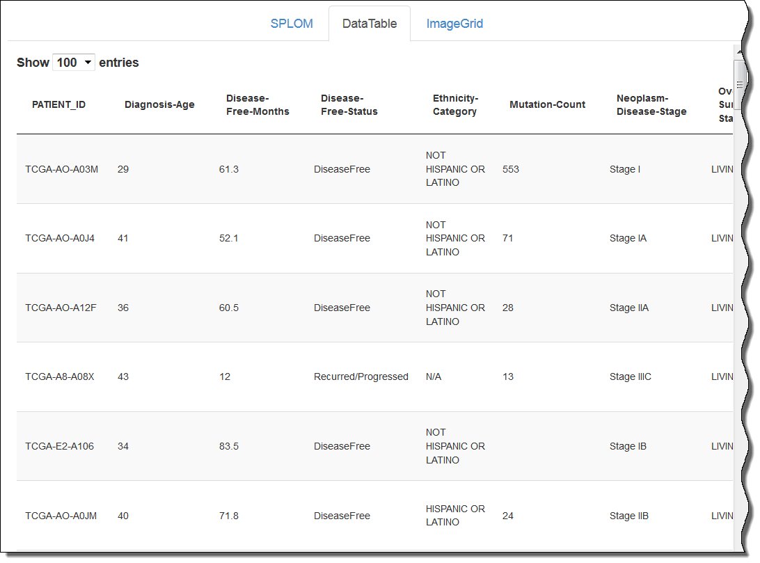
To select data in a data table, first click the DataTable tab, then click a row.
The single row appears in a new browser window.
Using a Bubble Chart
...