Page History
...
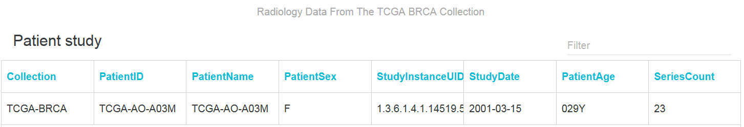
To select data in a data table, first click the DataTable tab, then click a row, which represents an image series.
The single row appears in a A new browser window appears, showing information about all of the images in that series.
Using the SPLOM Tab
DataScope displays both uses bubble charts, which charts and bar graphs on the SPLOM (ScatterPLot Of Matrices) tab. Bubble charts are a type of scatterplot in which the data points are replaced with bubbles. An additional dimension of the data is represented in the size of the bubbles. Can A bubble chart can be used to visualize 4 dimensions.four dimensions.
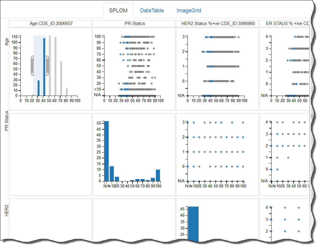
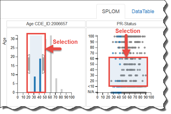
You can filter data on the SPLOM tab by adjusting the brackets in a histogram, as explained above, or by defining a selection area in a bubble chart.
Using an Image Grid
...