Page History
...
DataScope is a web application that allows you to browse and integrate multiple data types and visualize massive amounts of data. Using interactive, linked, dashboards, you can filter the data by attributes you select and view your results in scatterplotsbubble charts, data tables, image grids, and heatmaps.
Using the procedures explained in the DataScope Developer's Guide, you can customize your data, dashboards, and visualizations. This guide explains the way to manipulate the scatterplotsbubble charts, data tables, and image grids you use to visualize your data. This documentation does not yet include information about the heatmap visualization type.
...
DataScope is interactive and provides multiple options for visualizing a large database. These options include selecting filtering attributes and viewing the data in a table, bubble chart (also called scatterplot (or SPLOM), image grid, or heatmap.
In the case of scatterplotsbubble charts, you can use these options in combination. For example, if you have already applied a filtering attributeDataScope User's Guide (Draft) to show only one age group, you can further narrow down your selection by selecting a different category in the scatterplotbubble chart.
In the following example, a user has selected the filtering category of Asian and then further filtered the results to show those Asians between the ages of 30 and 40. Blue data points are selected, while grey are unavailable for selection.
...
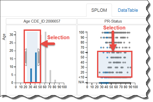
You can filter data on the SPLOM tab by adjusting the brackets in a histogram, as explained above, or by defining a selection area in a bubble chart. Only data points that appear in blue within the selection area are available for selection.
Using an Image Grid
...