 |
Page History
...
Introduction to DataScope
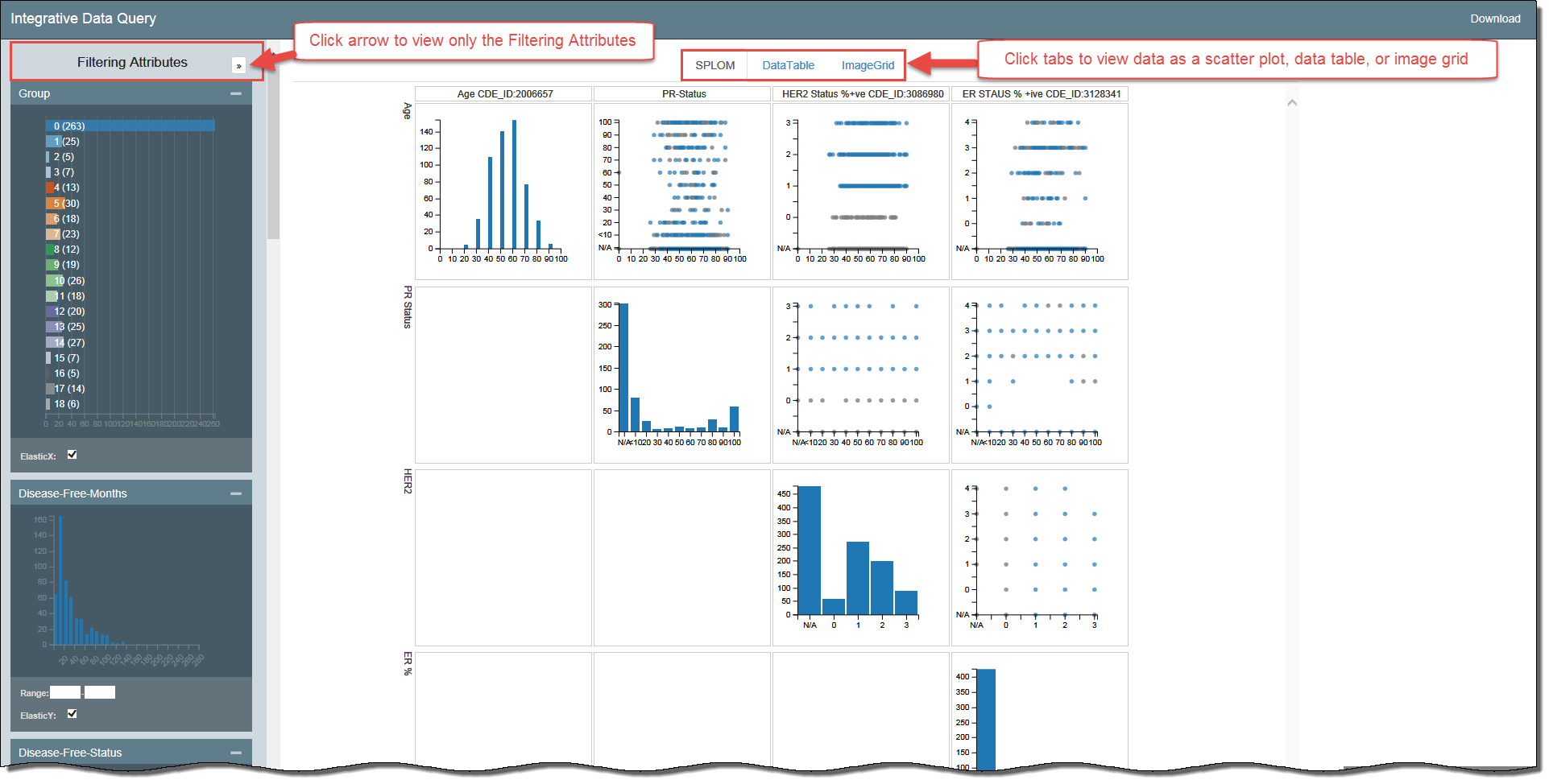
DataScope is a web application that allows you to browse and integrate multiple data types and visualize massive amounts of data. Using interactive, linked, dashboardsfilters and visualizations, you can filter narrow down the data by attributes you select and view your want to see and immediately see the results in bubble charts, data tables, image grids, and heatmaps.
Using the procedures explained in the DataScope Developer's Guide, you can customize your data, dashboardsavailable filters, and visualizationscharts. This guide explains the way to manipulate the bubble charts, data tables, and image grids you use to visualize your data. This documentation does not yet include information about the heatmap visualization type.
...
Accessing to DataScope
You must have a Google account to log in to DataScope.
To log in to access DataScope
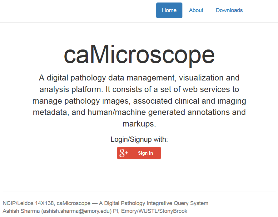
- In any browser, go to camicroscope.org/
.Multiexcerpt include nopanel true MultiExcerptName ExitDisclaimer PageWithExcerpt wikicontent:Exit Disclaimer to Include
The caMicroscope Login page appears. - Click .
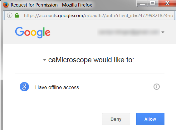
The Google Offline Access page appears. - Click Allow.
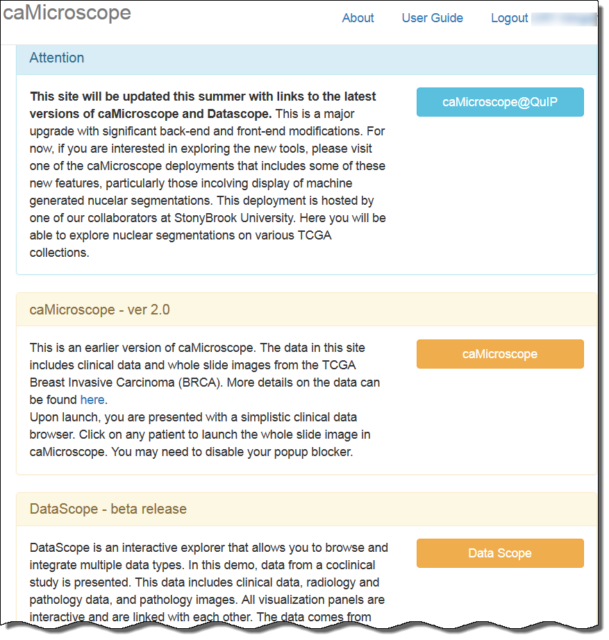
The caMicroscope page of product options appears. - Scroll down to the DataScope - beta release section and click .
A demo of DataScope appears, which includes data from a co-clinical study. This data includes clinical, radiology, and pathology data, and pathology images from UC University of California, Davis and the The Cancer Genome Atlas Breast Cancer (TCGA BRCA) study.
Filtering the Data
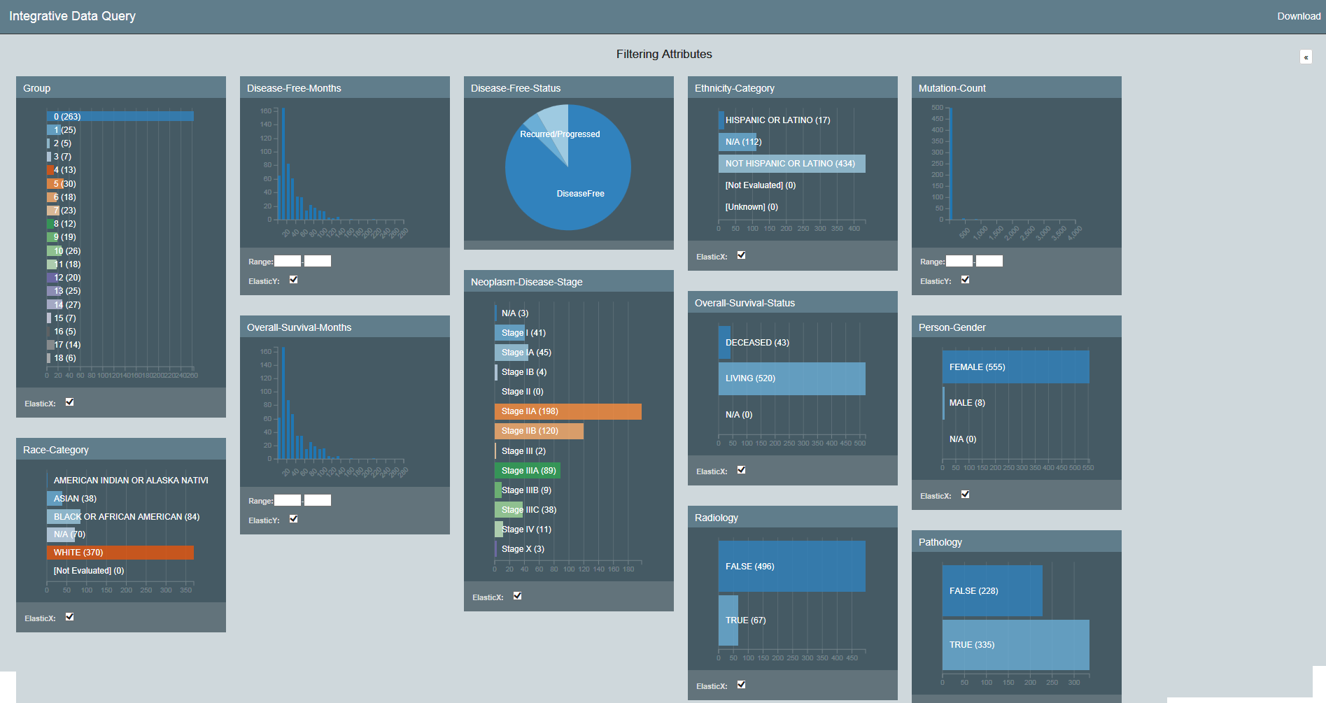
DataScope includes many filters for adjusting your view of the data. The filters that appear are those that an administrator has customized for your use with DataScope and are not necessarily represented in the screenshots in this guide. Filters are cumulative, which means that you can apply multiple filters to help narrow down your results. The filters are also interactive, meaning that when you set one filter, you impact the rest. For example, selecting one age cohort may mean that data is not available for a certain ethnicity.
For a more convenient view of the filtering options, click the arrow at the top of the Filtering Attributes panel. This expands the view of the filtering attributes so that they fill the screen.
...
All of the filtering attributes appear, as well as a Download link, for downloading a spreadsheet of the data after you have (or have not) filtered it.
You can also continue to view If you want to view the visualizations and filters at the same time, you can continue viewing the filtering attributes vertically and hide the . In this case, you may decide to hide some of the filtering attribute panels you do not want to use. Hide a panel by clicking the minus sign in the panel's upper left. Show it by clicking the plus sign in the panel's upper right.
...
You must clear each filter individually by clicking in each panel. As you clear a filter, the number of records that meet your filtering criteria will likely increasesincrease. You may want to note a control value, such as the number of records in the group, to illustrate the change in selected records as you apply filters.
...
