Page History
...
Tool | Name | Purpose |
| Annotations | Opens the Annotations panel, where you can select which annotation sets to view. |
| Layer Manager | Opens the Layers Manager panel, where you can select which layers to view. |
| Home | Return to the data table so that you can open another slide. |
| Draw | Draw thin lines, thick lines, or polygons on the image. To maintain the integrity of measurements, avoid drawing shapes that overlap or intersect one another. |
| Magnifier | The Magnifier works like a magnifying glass and allows you to see the slide at normal magnification (1.0), low magnification (0.5), or high magnification (2.0). Click a magnification level and place the bounding box on the area of the slide you want to magnify. |
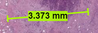
| Measurement | Drag this tool on the slide to learn the measurement in micrometers.
|
| Share View | Opens a window with a URL to the current presentation state of the slide including the magnification level, layers that are currently open, and your position on the image. |
| Side by Side Viewer | Shows the Layer Manager panel, the left and right layers, and inset window. |
| Heat Map | For a slide with heatmap data, opens the choices of heatmaps available, as well as ways of displaying the heatmaps. The gradient shows all of the values on the selected spectrum for the field you selected. A plot of cross-tabulated feature correlations appears. The heat map shown in the cross-tabulation is a sampling of over a million segmented objects in the dataset. Hover your mouse over the colored pixels in the feature correlations. Each pixel is a single segmented object. The features that intersect at each pixel are highlighted in yellow, the intersected pixel is outlined in orange and filled with an X, and the feature names appear in a popup window. |
| Labeling | |
| Segment | |
| Bug Report | Opens a Google Form where you can describe the issue you have experienced. |
| Reviewed | Click this button after reviewing a slide to change its review status. You are prompted to confirm this change. |