Page History
...
- Select the study whose data you want to analyze in the upper right portion of the caIntegrator page.
- Under Analysis Tools on the left sidebar, select K-M Plot.
- Select the For Annotation tab at the top of the page ().
Anchor RTF39383738383a204361707469 Fields for defining annotation data for a K-M plot - The groups to be compared in the K-M plot originate from one patient group. Varying data sets are based upon multiple values corresponding to the selected annotation. Define Patient Groups using these options:
- Annotation Type – Select the annotation type that identifies the patient group. Selections are based on the data in the chosen study.
- Annotation – Select an annotation. Fields are based on the annotation type you select. For example, if you choose Subject, then you could select Gender or Radiation Type or any field that would distinguish the patients into groups based upon their values.
- Only annotations that are defined with permissible values display in the dropdown list.
- Values – Using conventional selection techniques, select two or more values which will be the basis for the K-M plot. Permissible (available) values or "No Values" correspond to the selected annotation.
- Survival value is the length of time the patient lived. caIntegrator displays valid survival values entered for this study. Select the survival measure which is the unit of measurement for the survival value to be used for the plot.
- Click the Create Plot button.
caIntegrator generates the plot which then displays below the plot criteria ().
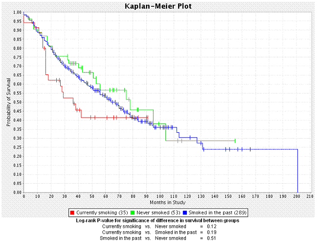
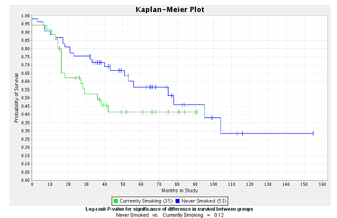
- The number of subjects for each group appears embedded in the legend of the graph below the plot.
- caIntegrator generates a P-value for the selected groups; it displays at the bottom of the page. A low P-value generally has more significance than a high P-value.
- For information regarding the P-value calculation, see .
...
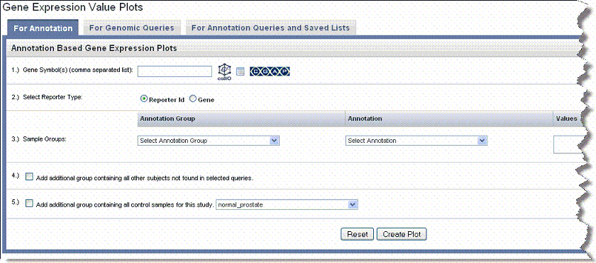
- Select the study whose data you want to analyze in the upper right portion of the caIntegrator page. You must select a study with gene expression data.
- Under Analysis Tools on the left sidebar, select K-M Plot.
- Select the For Gene Expression tab ().
- For Gene Symbol, enter one or more gene symbols in the text box or click the icons to locate genes in the following databases. If you enter more than one gene in the text box, separate the entries by commas.
...
- After you have defined the criteria as described in , caIntegrator generates the plot which then displays below the plot criteria.
- The gene symbol for each group represented in the data appears with its color correlation to the plot embedded in the legend of the graph below the plot. Three lines on the plot represent each gene symbol entered for the plot. Each line of the three represents a subgroup of people carrying the gene--one line for overexpressed values, one line for under expressed values and one line for intermediate values which represents gene values that are not up-regulated nor down-regulated.
- In queries that include a fold change criterion and that are configured to return genomic data, raw expression values are replaced with calculated fold change values.
- A P-value is also generated for the selected groups; it displays at the bottom of the page. A low P-value generally has more significance than a high P-value.
- For information regarding the P-value calculation, see .
...
- Select the study whose data you want to analyze in the upper right portion of the caIntegrator page. The queries you identify for the K-M plot must have been saved previously in caIntegrator.
- Under Analysis Tools on the left sidebar, select K-M Plot.
- Select the For Queries and Saved Lists tab ().
- Queries – Select Queries whose data you want to analyze from the All Available Queries panel and move them to the Selected Queries panel using the Add >> button.
- Genomic queries do not appear in the lists; they cannot be selected for this type of K-M plot.
- Exclusive Subject in Queries – Check the box if you want to exclude any subjects that appear in both (or all) queries selected for the plot, thus eliminating overlap.
- Add Additional Group...all other subjects – Check the box to create an additional group of all other subjects that are not in selected query groups.
- Survival value – The length of time the patient lived. Select the survival measure which is the unit of measurement for the survival value to be used for the plot.
- Click the Create Plot button. caIntegrator generates the plot which then displays below the plot criteria ().
See .
| Anchor | ||||
|---|---|---|---|---|
|
After you have defined the criteria as described in , caIntegrator generates the plot which then displays below the plot criteria.
- The number of subjects for each group appears embedded in the legend of the graph below the plot.
- A P-value is also generated for the selected groups; it displays at the bottom of the page. A low P-value generally has more significance than a high P-value.
- For information regarding the P-value calculation, see .
...
- Select the study whose data you want to analyze in the upper right portion of the caIntegrator page. (You must select a study which has genomic data.)
- Under Analysis Tools on the left sidebar, select Gene Expression Plot. This opens a page with three tabs
- Select the For Annotation tab ().
- Gene Symbol – Enter one or more gene symbols in the text box or click the icons to locate genes in the following databases. If you enter more than one gene in the text box, separate the entries by commas.
...
See .
Gene Expression Plot for Annotation Display*
After you have defined the criteria as described in , caIntegrator generates the plot which then displays below the plot criteria.
Legends below the plot indicate the plot input. By default, the plot shows the mean of the data. displays a plot with gene expression median calculation summaries.
- You can recalculate the data display by clicking the Plot Type above the graph. See .
- You can modify the plot parameters and click the Reset button to recalculate the plot.
...
- Select the study whose data you want to analyze in the upper right portion of the caIntegrator page. (You must select a study which has genomic data.)
- Under Analysis Tools on the left sidebar, select Gene Expression Plot.
- Select the For Genomic Queries tab ().
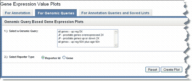
- Genomic Query – Click on the genomic query upon which the plot is to be based.
- Reporter Type – Select the radio button that describes the reporter type:
- Reporter ID – Summarizes expression levels for all reporters you specify.
- Gene Name – Summarizes expression levels at the gene level.
- Click the Create Plot button. caIntegrator generates the plot which then displays below the plot criteria. Legends below the plot indicate the plot input ().
- You can recalculate the data display by clicking the Plot Type above the graph. See .
- You can modify the plot parameters and click the Reset button to recalculate the plot.
...
- Select the study whose data you want to analyze in the upper right portion of the caIntegrator page. You must select a study saved as a subject annotation study, but which has genomic data.
- Under Analysis Tools on the left sidebar, select Gene Expression Plot.
- Select the For Annotation Queries and Saved Lists tab ().
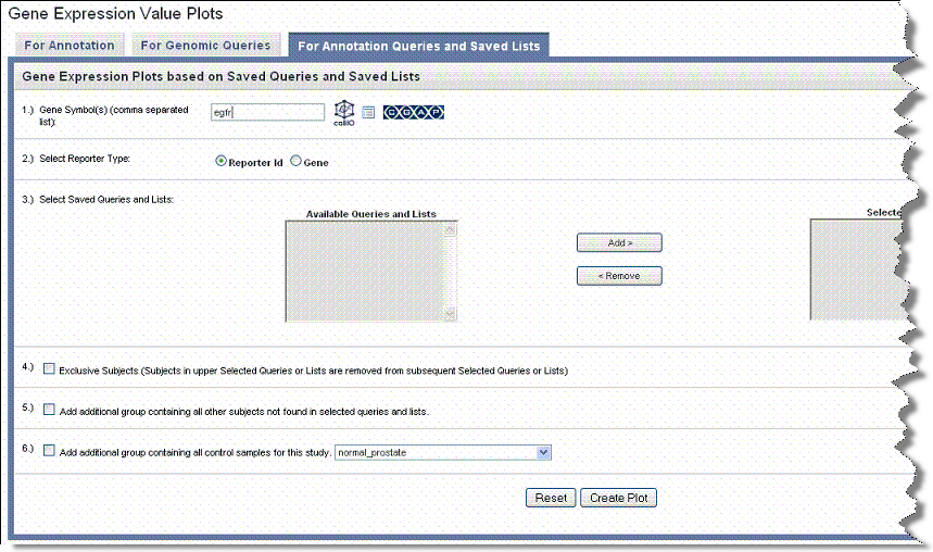
- Gene Symbol – Enter one or more gene symbols in the text box or click the icons to locate genes in the following databases. If you enter more than one gene in the text box, separate the entries by commas.
...
After you have defined the criteria as described in , caIntegrator generates the plot which displays in bar graph format below the plot criteria.
By default, caIntegrator displays the mean of the data below the plot criteria. Legends below the plot indicate the plot input.
- You can recalculate the data display by clicking the Plot Type above the graph. See .
- You can modify the plot parameters and click the Reset button to recalculate the plot.
...
Above the plot, you can select various plot types. When you do so, the plot is recalculated. Although all of the plots in this section appear similar, note the differences in calculation results and legends between the Y axis on each of the plots.
When you perform a Gene Expression simple search, by default the Gene Expression Plot () appears.
The Gene Expression Plot () displays mean expression intensity (Geometric mean) versus Groups.
The log2 intensity Gene Expression Plot, shown in the following figure, displays average expression intensities for the gene of interest based on Affymetrix GeneChip arrays (U133 Plus 2.0 arrays).
The box and whisker log2 expression intensity plot displays a box plot (, ). Example box and whisker plot:uses foruses of box and whisker plots include the following:
- Indicate whether a distribution is skewed and whether there are potential unusual observations (outliers) in the data set.
- Perform a large number of observations.
- Compare two or more data sets.
- Compare distributions because the center, spread, and overall range are immediately apparent.
| Wiki Markup |
|---|
In descriptive statistics, a box plot or boxplot, also known as a box-and-whisker diagram or plot, is a convenient way of graphically depicting groups of numerical data through their five-number summaries (the smallest observation excluding outliers, lower quartile \[Q1\], median \[Q2\], upper quartile \[Q3\], and largest observation excluding outliers). |
The box is defined by Q1 and Q3 with a line in the middle for Q2. The interquartile range, or IQR, is defined as Q3-Q1. The lines above and below the box, or 'whiskers', are at the largest and smallest non-outliers. Outliers are defined as values that are more than 1.5 * IQR greater than Q3 and less than 1.5 * IQR than Q1. Outliers, if present, are shown as open circles ().
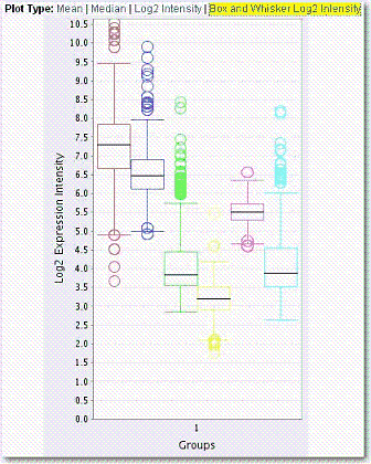
Boxplots can be useful to display differences between populations without making any assumptions of the underlying statistical distribution: they are non-parametric. The spacings between the different parts of the box help indicate the degree of dispersion (spread) and skewness in the data.
...
- Select the study whose data you want to analyze in the upper right portion of the caIntegrator page.
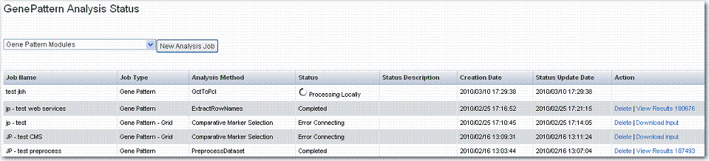
- Click GenePattern Analysis in the left sidebar of caIntegrator. This opens the GenePattern Analysis Status page ().
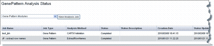
- Select from the drop-down list the type of GenePattern analysis you want to run on the data.
- GenePattern Modules – This option launches a session within GenePattern from which you can launch analyses. See .
- Comparative Marker Selection (Grid Service). This option enables you to run this GenePattern analysis on the grid. See .
- Principal Component Analysis (Grid Service). This option enables you to run this GenePattern analysis on the grid. See .
- GISTIC (Grid Service). This option enables you to run this GenePattern analysis on the grid. See .
- Click the New Analysis Job button to open a corresponding page where you can configure the analysis parameters.
...
- Select the study whose data you want to analyze in the upper right portion of the caIntegrator page.
- Click GenePattern Analysis in the left sidebar of caIntegrator. This opens the GenePattern Analysis Status page.
- Make sure GenePattern Modules is selected in the drop down list. Click New Analysis Job.
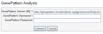
- In the GenePattern Analysis dialog box (), specify connection information, described in the following table and click Connect.
Fields
Description
Server URL
Enter any GenePattern publicly available URL, such as
GenePattern Username
Enter your GenePattern user name.
GenePattern Password
Enter your GenePattern password.
Fields for selecting GenePattern configurationsAnchor RTF34313631303a205461626c65 RTF34313631303a205461626c65
- After logging in with the GenePattern profile, the dialog box expands to includes fields for defining your GenePattern analysis..
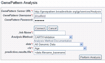
- Enter information for the following fields. Fields with a red asterisk are required:
- Job Name* – Enter a unique name for the analysis
- Analysis Method – Select any method from the drop down list. Click Analysis Method Documentation for descriptions of the different analysis methods.
- Data* – All genomic data is selected by default. Select from the list any list that has been created for this study.
- cls* – Select any annotation field
...
Once the analysis is launched, caIntegrator returns to the GenePattern Analysis Status page where you can monitor the status of your current study which is listed in the Analysis Method column as well as view information about other GP analyses that have been run on this study.
If you choose to access GenePattern in this way, you can continue to use GenePattern tools from within that application. See GenePattern user documentation for more information.
...
- Select the study whose data you want to analyze in the upper right portion of the caIntegrator page. You must select a study saved as a subject annotation study, but which has genomic data.
- Click GenePattern Analysis in the left sidebar of caIntegrator. This opens the GenePattern Analysis Status page.
- In the GenePattern Analysis Status page, select Comparative Marker Selection (Grid Service) from the drop down list and click New Analysis Job. This opens the Comparative Marker Selection Analysis page ().
- Select or define CMS analysis parameters, described in the following table. An asterisk indicates required fields. The default settings are valid; they should provide valid results.
CMS Parameter
Description
Job Name*
Assign a unique name to the analysis you are configuring.
Preprocess Server*
A server which hosts the grid-enabled data GenePattern PreProcess Dataset module. Select one from the list and caIntegrator will use the selected server for this portion of the processing.
Comparative Server*
A server which hosts the grid-enabled data GenePattern Comparative Marker Selection module. Select one from the list and caIntegrator will use the selected server for this portion of the processing.
Annotation Queries and Lists*
All subject annotation queries and gene lists with appropriate data for the analysis are listed. Select and move two or more queries from the All Available Queries panel to the Selected Queries panel using the Add > and Remove < buttons.
<ac:structured-macro ac:name="unmigrated-wiki-markup" ac:schema-version="1" ac:macro-id="75271c47396efac8-868979f0-40d140e0-bc3086cf-016edc43c25f7b3d49ec830e"><ac:plain-text-body><![CDATA[Note: The [SL] and [Q] prefixes to list names indicate "Subject Lists" or "Saved Queries". A "G" in the prefix indicates the list is Global. For more information, see on page 69.]]></ac:plain-text-body></ac:structured-macro>
Filter Flag
Variation filter and thresholding flag
Preprocessing Flag*
Discretization and normalization flag
Min Change*
Minimum fold change for filter
Min Delta*
Minimum delta for filter
Threshold*
Value for threshold
Ceiling*
Value for ceiling
Max Sigma Binning*
Maximum sigma for binning
Probability Threshold*
Value for uniform probability threshold filter
Num Exclude*
Number of experiments to exclude (max & min) before applying variation filter
Log Base Two
Whether to take the log base two after thresholding; default setting is "Yes".
Number of Columns Above Threshold*
Remove row if n columns are not >= than the given threshold
In other words, the module can remove rows in which the given number of columns does not contain a value greater or equal to a user defined threshold.Test Direction*
The test to perform (up-regulated for class0; up-regulated for class1, two sided). By default, Comparative Marker Selection performs the two-sided test.
Test Statistic*
Select the statistic to use.
Min Std*
The minimum standard deviation if test statistic includes the min std option. Used only if test statistic includes the min std option.
Number of Permutations*
The number of permutations to perform. (Use 0 to calculate asymptotic P-values.) The number of permutations you specify depends on the number of hypotheses being tested and the significance level that you want to achieve (3). The greater the number of permutations, the more accurate the P-value.
Complete – Perform all possible permutations. By default, complete is set to No and Number of Permutations determines the number of permutations performed. If you have a small number of samples, you might want to perform all possible permutations.
Balanced – Perform balanced permutationsRandom Seed*
The seed for the random number generator.
Smooth P-values
Whether to smooth P-values by using the Laplace's Rule of Succession. By default, Smooth P-values is set to Yes, which means P-values are always less than 1.0 and greater than 0.0.
Phenotype Test*
Tests to perform when class membership has more than 2 classes: one versus-all, all pairs.
Note: The P-values obtained from the one-versus-all comparison are not fully corrected for multiple hypothesis testing.- Comparative Marker Selection analysis options
Anchor RTF31353237303a205461626c65 RTF31353237303a205461626c65
- Comparative Marker Selection analysis options
- When you have completed the form, click Perform Analysis.
...
- Select the study whose data you want to analyze in the upper right portion of the caIntegrator page. You must select a study with copy number (either Affymetrix SNP or Agilent Copy Number) data.
- Click GenePattern Analysis in the left sidebar of caIntegrator. This opens the GenePattern Analysis Status page.
- In the GenePattern Analysis Status page, select GISTIC (Grid Service) from the drop down list and click New Analysis Job. This opens the GISTIC Analysis page ().
- Select or define GISTIC analysis parameters, as described in the following table. You must indicate a Job Name, but you can accept the other defaults settings, which are valid and should produce valid results.
GISTIC Parameters
Description
Job Name*
Assign a unique name to the analysis you are configuring.
GISTIC Service Type*
Select whether to use the GISTIC web service or grid service and provide or select the service address. If the web service is selected, authentication information is also required
GenePattern User Name/Password
Include these to log into GenePattern for the analysis.
Annotation Queries and Lists
All annotation queries display in this list as well as an option to select all non-control samples. Select an annotation query if you wish to run GISTIC on a subset of the data and select all non-control samples if wish to include all samples.
Select Platform
This option appears only if more than one copy number platform exists in the study. Select the appropriate platform from the drop-down list ().
Exclude Sample Control Set
From the drop-down list, select the name of the control set you want to exclude from the analysis. Click None if that is applicable.
Amplifications Threshold*
Threshold for copy number amplifications. Regions with a log2 ratio above this value are considered amplified. Default = 0.1.
Deletions Threshold*
Threshold for copy number deletions. Regions with a log2 ratio below the negative of this value are considered deletions. Default = 0.1.
Join Segment Size*
Smallest number of markers to allow in segments from the segmented data. Segments that contain fewer than this number of markers are joined to the neighboring segment that is closest in copy number. Default = 4.
<ac:structured-macro ac:name="unmigrated-wiki-markup" ac:schema-version="1" ac:macro-id="5e7e1b546e29d9a3-e7afed02-48b84709-9b7183f0-d27659e744cc288d15874259"><ac:plain-text-body><![CDATA[
QV Thresh[hold]*
Threshold for q-values. Regions with q-values below this number are considered significant. Default = 0.25.
]]></ac:plain-text-body></ac:structured-macro>
Remove X*
Flag indicating whether to remove data from the X-chromosome before analysis. Allowed values = {1,0}. Default = 1(yes).
cnv File
This selection is optional.
Browse for the file. There are two options for the CNV file.
Option #1 enables you to identify CNVs by marker name. Permissible file format is described as follows:
A two column, tab-delimited file with an optional header row. The marker names given in this file must match the marker names given in the markers_file. The CNV identifiers are for user use and can be arbitrary. The column headers are: - Marker Name
- CNV Identifier
Option #2 enables you to identify CNVs by genomic location. Permissible file format is described as follows:
A 6 column, tab-delimited file with an optional header row. The 'CNV Identifier', 'Narrow Region Start' and 'Narrow Region End' are for user use and can be arbitrary. The column headers are: - CNV Identifier
- Chromosome
- Narrow Region Start
- Narrow Region End
- Wide Region Start
- Wide Region End|
- GISTIC analysis parameters
- When you have completed the form, click Perform Analysis.
- When the job is complete, the system displays a completion date on the GenePattern Analysis status page. Click the Download link. This downloads zipped result files to your local work station. The number of files and their file type will vary according to the processing. The results format is compatible with GenePattern visualizers and can be uploaded within GenePattern.
- Additionally, upon completion of a successful GISTIC anaylsis, caIntegrator automatically displays the two gene lists that it generates in the Gene List Picker so that you can use them in a caIntegrator query or plot calculation. The lists are visible only to your userID. For more information, see . The genes will also display in Saved Copy Number Analyses in the left sidebar. See on page 74.
- If samples from a copy number source are deleted, the GISTIC job in which they are appear is also deleted.
...