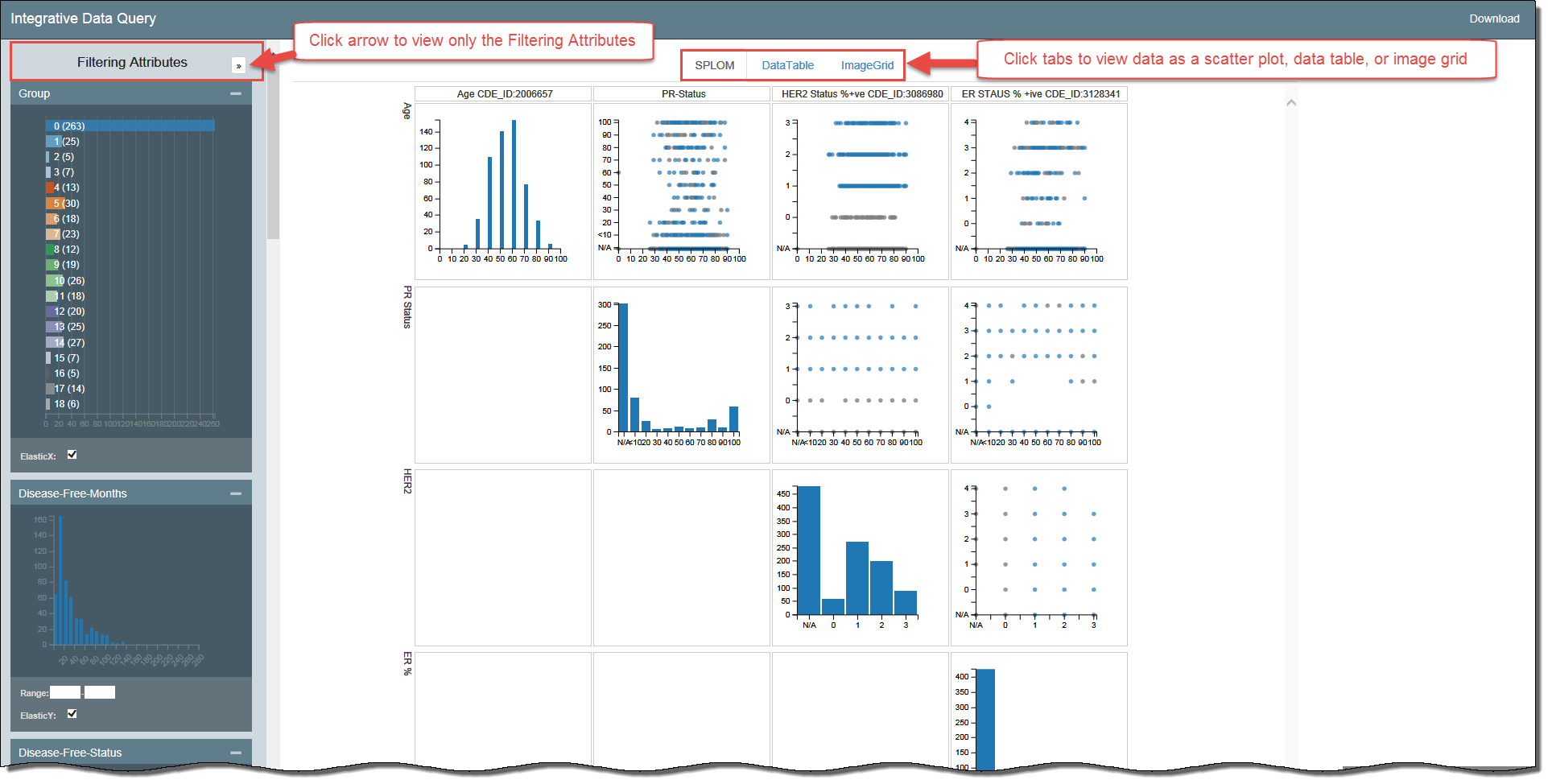
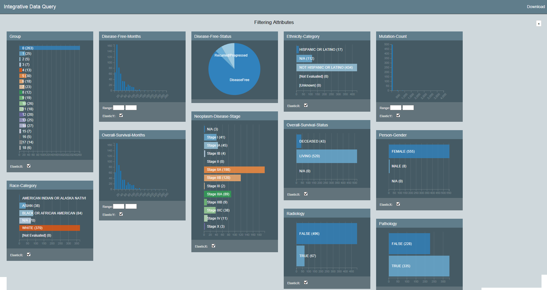
The Integrative Data Query application allows you to visualize massive amounts of data. Using interactive dashboards, you can filter the data by attributes and view your results in bubble charts, data tables, image grids, and heat maps.
Using the procedures explained in the Datascope Developer's Guide, you can customize your data set, dashboards, and visualizations.
Introduction to the Integrative Data Query Interface
Filtering Your Data
Understanding the Visualization Types
Data Table: Provides a tabular representation of the provided attributes. Shows 100 records at a time.
Bubble Chart: A bubble chart is a variation of a scatter chart in which the data points are replaced with bubbles, and an additional dimension of the data is represented in the size of the bubbles. Can be used to visualize 4 dimensions.
Image Grid: A list of images that is by default two columns but expands to add more columns when more screen real estate becomes available.
Heatmap: A heatmap is a graphical representation of data where the individual values contained in a matrix are represented by colors.


