NIH | National Cancer Institute | NCI Wiki  

Error rendering macro 'rw-search'

null

You are viewing an old version of this page. View the current version.

Compare with Current View Page History

« Previous Version 11 Next »

DataScope is a web application that allows you to visualize massive amounts of data. Using interactive dashboards, you can filter the data by attributes and view your results in scatterplots, data tables, image grids, and heatmaps.


Contents of this Guide

Introduction

DataScope is an interactive explorer that allows you to browse and integrate multiple data types. In this demo, data from a co-clinical study is presented. This data includes clinical data, radiology and pathology data, and pathology images. All visualization panels are interactive and are linked with each other. The data comes from UC Davi), and the TCGA BRCA study.
Using the procedures explained in the Datascope Developer's Guide, you can customize your data set, dashboards, and visualizations. This guide explains the way to manipulate the scatterplots, data tables, and image grids. In the future, this documentation will be updated to include an explanation of how to use the heatmap visualization type.

Logging in to Datascope

You must have a Google account to log in to Datascope.

To log in to Datascope

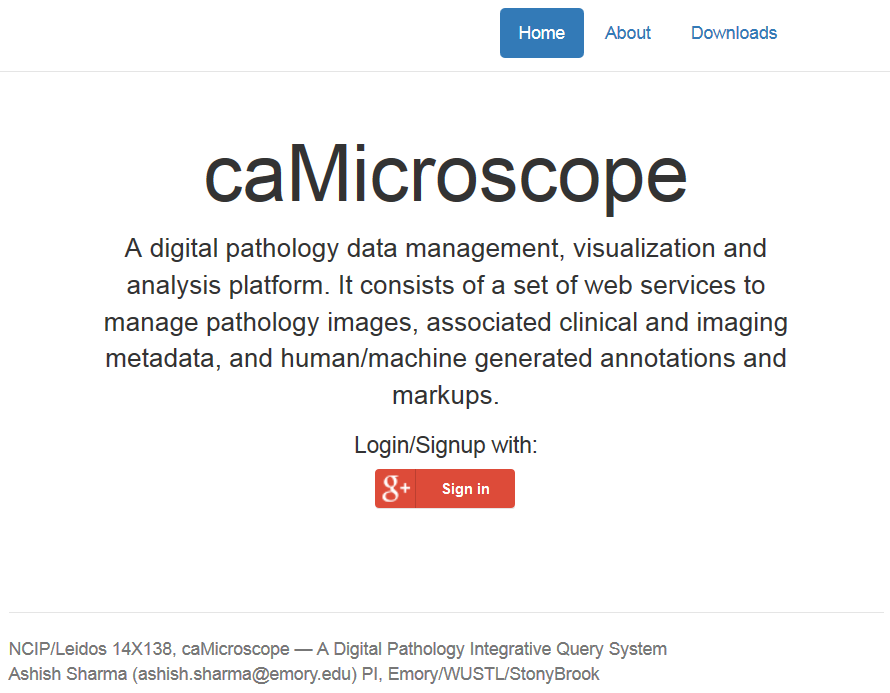
  1. In any browser, go to camicroscope.org/ Exit Disclaimer logo .
    The caMicroscope Login page appears.
  2. Click Google Plus Sign In.
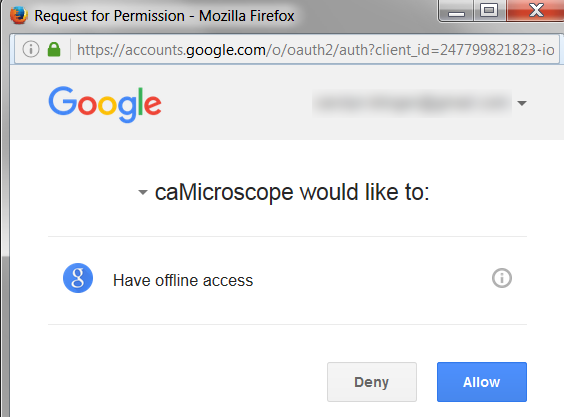
    The Google Offline Access page appears.
    Google Offline Access Request page. caMicroscope would like to have offline access. Deny or Allow.
  3. Click Allow.
    The caMicroscope page of product options appears.

Introduction to the Integrative Data Query Interface

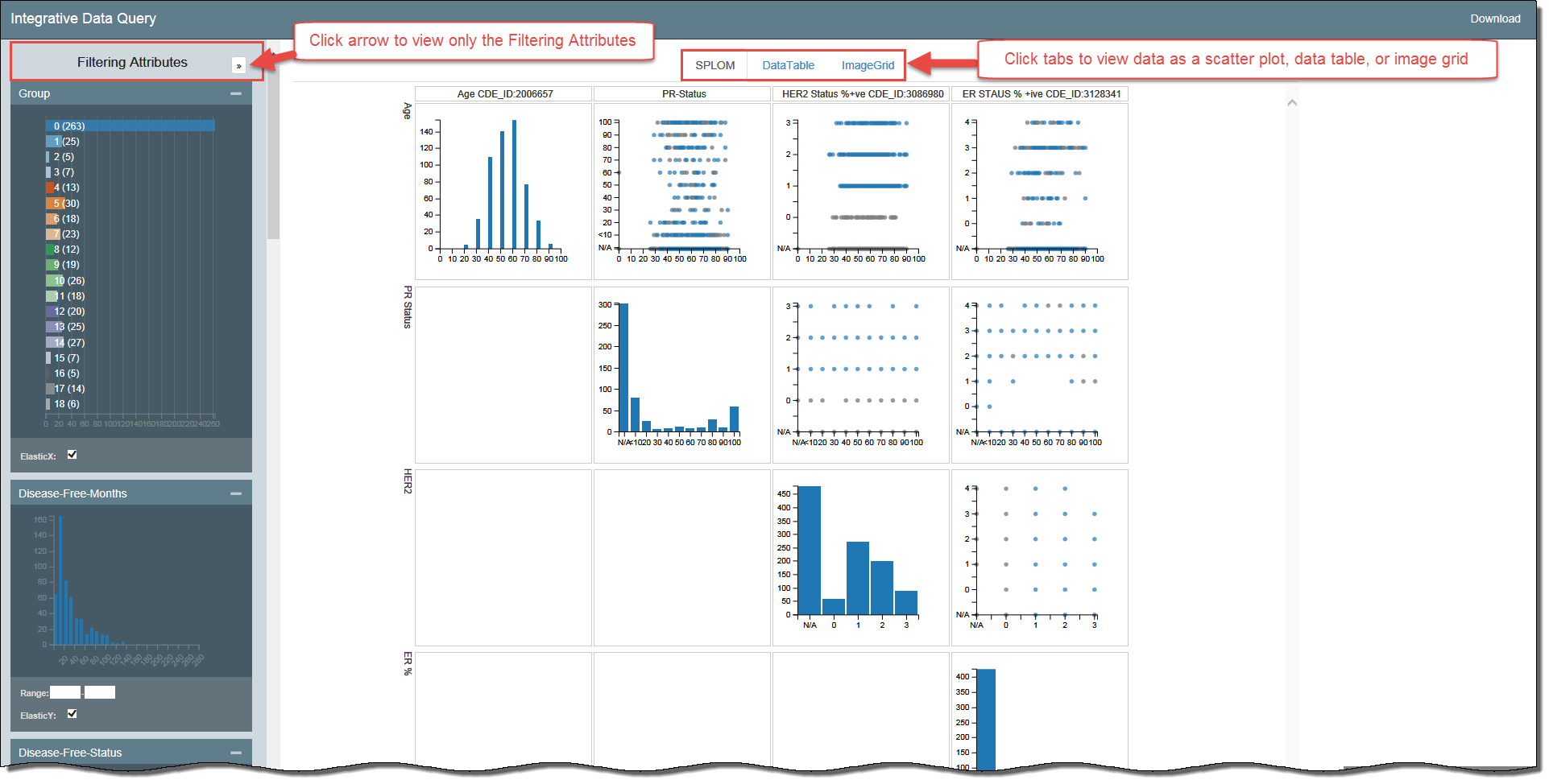
Integrative Data Query window highlighting the arrow next to the Filtering Attributes and the three visualization tabs

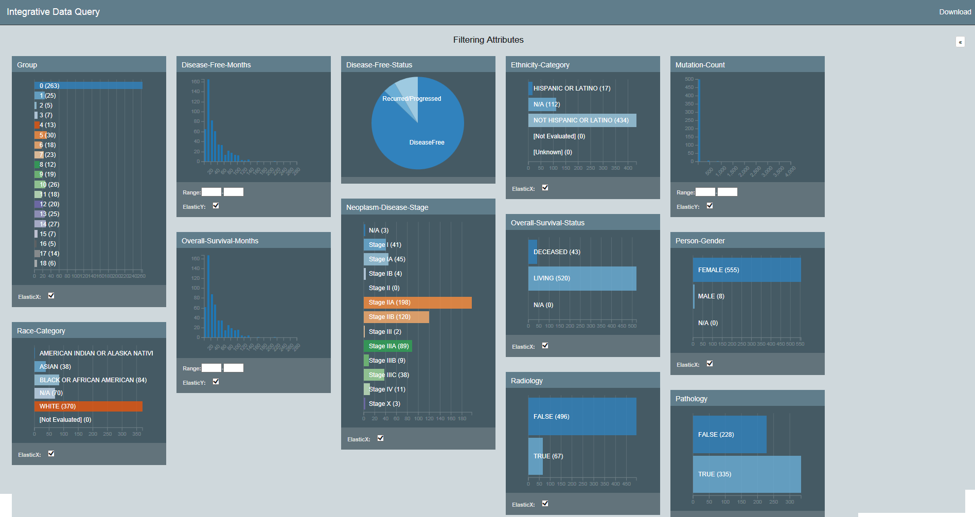
Filtering Attributes of the Integrative Data Query Application

Filtering Your Data

Understanding the Visualization Types

Data Table: Provides a tabular representation of the provided attributes. Shows 100 records at a time.

Bubble Chart: A bubble chart is a variation of a scatter chart in which the data points are replaced with bubbles, and an additional dimension of the data is represented in the size of the bubbles. Can be used to visualize 4 dimensions.

Image Grid: A list of images that is by default two columns but expands to add more columns when more screen real estate becomes available.

Heatmap: A heatmap is a graphical representation of data where the individual values contained in a matrix are represented by colors.


  • No labels